The best way to achieve it is to design mobile-first, then scale up using flexible grids and breakpoints. Keep buttons visible, text readable, and load times fast across every screen size. This keeps the experience consistent, not just resized or stretched to fit.
Ever lost a customer without knowing it,
just because your site broke on their phone?

It’s 8 PM on a Saturday.
A customer finds your store on mobile.
She taps the link but the page loads slowly.
Text overlaps the buttons.
Images spill off the screen.
She tries to add a product to cart.
The button is hidden below the fold.
Nothing lines up right.
She gives up after a few seconds.
Opens a competitor’s site instead.
That one loads clean on her phone.
She buys it there instead.
You never even knew she visited.
Why Responsive Design Is the Heart of Modern User Experience (UX)?
Responsive design is a necessity.
It’s the approach where a website’s layout automatically adjusts to fit different screen sizes and resolutions, giving users a smooth experience on every device.
We follow responsive design best practices that ensure consistency and comfort for every visitor. But first, let’s understand the foundation.
There are two main approaches to handling different screens: adaptive vs responsive design.
- Adaptive design creates multiple fixed layouts for specific devices (like desktop, tablet, or mobile).
- Responsive design, on the other hand, uses flexible grids and CSS rules that fluidly adjust as the screen changes.
While both improve user experience across devices, responsive design offers more flexibility and scalability for modern websites.
A strong responsive web design uses:
- Fluid grid layouts that scale content proportionally.
- Flexible images and media that resize without distortion.
- CSS media queries set rules for various breakpoints.
Learn more about Mobile Navigation Patterns.
What Are the Most Common Responsive Design Mistakes to Avoid?
Even with responsive layouts, many websites make small but costly UX mistakes in responsive design. We often see:
- Hidden or cut-off buttons that frustrate mobile users.
- Unreadable text that’s too small or lacks contrast.
- Distorted visuals that break the brand’s credibility.
- Overcrowded layouts that feel cluttered on smaller screens.
These issues happen when designers focus only on layout & not on user experience across devices.
Poor screen size breakpoints or inconsistent spacing can make navigation confusing and destroy usability.
To fix this, we always promote a UX-first mindset. That means designing with empathy and accessibility in mind.
Every button, font, and visual should serve a purpose and feel natural, no matter the screen.
By following inclusive design principles, you create experiences that work for everyone, everywhere.
Why Is Mobile-First the Winning Responsive Design Strategy?

If there’s one golden rule in responsive web design, it’s this: Start small, then scale up. That’s the importance of the mobile-first design approach.
In simple terms, mobile-first means designing for the smallest screen first, typically a smartphone, and then expanding the layout for tablets, laptops, and desktops.
Over 70% of global traffic now comes from mobile devices. Users expect a mobile-friendly website design. Here’s why a mobile-first design approach is so powerful:
- Faster performance: Lighter layouts and fewer elements load quicker on mobile networks.
- Cleaner UI: Forces designers to prioritize what truly matters to users.
- Better ranking: Google’s algorithm now rewards mobile-friendly websites through mobile-first indexing.
We use modern tools and techniques like Figma’s auto layout, CSS flexbox, and responsive frameworks to simplify the workflow.
Our focus is on delivering smooth navigation, clear CTAs, and a delightful UX across all devices.
Businesses that prioritize mobile-first will always stay ahead in search visibility, performance, and customer satisfaction.
Learn to Optimize Mobile App Performance.
How to Set the Right Breakpoints for a Smooth Responsive Design?
In responsive web design, screen size breakpoints are the invisible lines that show when your layout changes to fit a new device.
Without the right responsive design breakpoints, your design might stretch awkwardly or collapse altogether.
Recommended Screen Size Breakpoints
While every project is different, these are the most effective breakpoints that we use in our responsive web design services:
- Mobile phones: 360px – 480px
- Tablets: 768px – 1024px
- Laptops: 1280px – 1440px
- Desktops & Ultra-wide screens: 1920px and beyond
These breakpoints ensure your website or app works smoothly across the most popular devices, from compact smartphones to 4K monitors.
For design and development, we depend on frameworks like Tailwind CSS and Bootstrap, and design tools like Figma auto-layout.
With the right screen size breakpoints in web design, your users will never feel like they’ve switched devices, not screens.
What Are the Best Responsive Design Practices Across Devices?
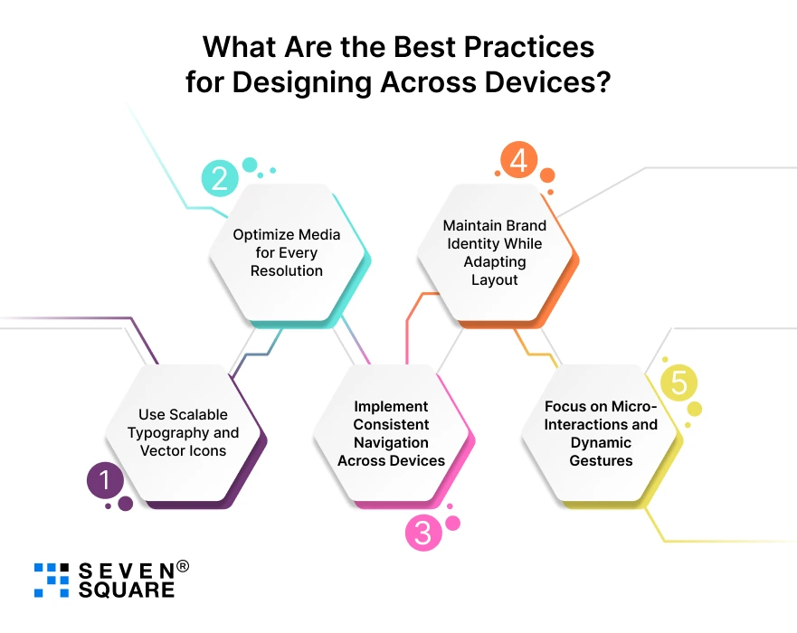
By following these best practices for designing for different screen sizes, we ensure that every digital experience feels smooth, dynamic, and brand-consistent.
1. Use Scalable Typography and Vector Icons
- Fonts and icons should adapt gracefully. We use responsive units (like rem and vw ) so text scales naturally across devices.
- Vector icons (SVGs) remain sharp on retina and 4K screens.
2. Optimize Media for Every Resolution
- Images and videos should load fast and look clear.
- Our team uses responsive image formats (WebP, AVIF) and adaptive compression to maintain visual quality without slowing down load times.
3. Implement Consistent Navigation Across Devices
- Navigation is the backbone of user experience across devices.
- Whether it’s a hamburger menu on mobile or a sticky bar on desktop, consistency is key.
4. Maintain Brand Identity While Adapting Layout
- Every screen may look different, but your brand shouldn’t.
- From typography to color palettes, we ensure your mobile-friendly website design feels balanced, no matter where users view it.
5. Focus on Micro-Interactions and Dynamic Gestures
- Subtle animations and gestures (like swipes, taps, or hover effects) add delight to UX.
- These responsive design best practices create a more engaging and human-centered experience.
When combined, these elements build designs that are emotionally engaging and conversion-driven.
Explore the Top 10 UI/UX Mistakes That You Should Avoid.
What’s the Future of Responsive Design Beyond Mobile and Desktop?
The future of responsive design is expanding beyond the traditional trio of mobile, tablet, and desktop.
We’re already designing for new screen types like foldable phones, wearables, AR interfaces, and smart TVs.
Think Beyond Pixels
Designing for multiple devices is about context and interaction. For example:
- A smartwatch focuses on micro-interactions.
- A foldable phone emphasizes multi-view layouts.
- A smart TV prioritizes readability from a distance.
What’s Next?
In the next 3 years, responsive web design will evolve into adaptive experience design, where AI and user data change interfaces in real time.
What’s Our Expertise in Creating Pixel-Perfect Responsive Designs?
We make your mobile-friendly website development effortless, effective, and visually stunning. Here’s how we ensure smooth UX across all screen sizes:
- Customized UX strategies for every screen size and platform.
- Latest tools like Figma, React, and Tailwind CSS for scalable design.
- Real-time cross-device testing and optimization to ensure perfect performance.
- Proven results show higher engagement, better retention, and faster load speeds.
Want Responsive Design? Contact Us Now!
Great Responsive Design Fits Every Screen and Every User
We believe that designing for different screen sizes is really about designing for all users.
A truly responsive website adapts to people, not just devices.
By following responsive web design best practices, you can create experiences that are inclusive, accessible, and delightful on every screen.
Pixel perfection is nice, but UX perfection is what keeps users coming back.
FAQs
- Typical breakpoints include 480px (mobile), 768px (tablet), 1024px (small desktop), and 1440px (large screens).
- These ensure smooth transitions across devices.
- Use a mobile-first design approach, flexible grids, and test across real devices. Focus on readability, spacing, and navigation.
- Use tools like Chrome DevTools, BrowserStack, and LambdaTest for accurate, cross-device testing.
- Top tools include Figma, Tailwind CSS, Bootstrap 5, Framer, and Responsively App for testing layouts efficiently.