Flutter UI/UX in 2026 comes down to responsive widgets, breakpoint-based layouts, and performance built in from day one, not added on later. Tools like LayoutBuilder, MediaQuery, and AspectRatio let a single Flutter codebase adapt cleanly across phones, tablets, and desktops.
Why Flutter UI/UX Directly Shapes Business Results
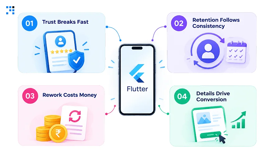
1. Trust Breaks Fast
Users judge an app within seconds of opening it.
Misaligned buttons or clipped text signal carelessness instantly.
First impressions rarely get a second chance.
Once trust drops, users rarely give an app another try.
2. Retention Follows Consistency
Apps that feel the same across every screen keep users engaged longer.
Inconsistent layouts create friction users don’t consciously notice, but feel.
That friction quietly drives uninstalls over time.
Consistency, more than novelty, is what keeps people coming back.
3. Rework Costs Money
Fixing responsive design after launch costs far more than building it right initially.
Teams end up patching device-specific bugs one at a time.
This drains budget better spent on new features.
Every emergency fix also delays whatever was actually on the roadmap.
4. Details Drive Conversion
A stretched image or cramped tap target directly affects checkout completion.
Small UI failures compound into measurable revenue loss.
Flutter UI/UX isn’t decoration, it’s part of the funnel.
Every screen a user passes through either moves them closer to converting or pushes them away.
Top 10 Flutter UI/UX Tips to Build Responsive Apps
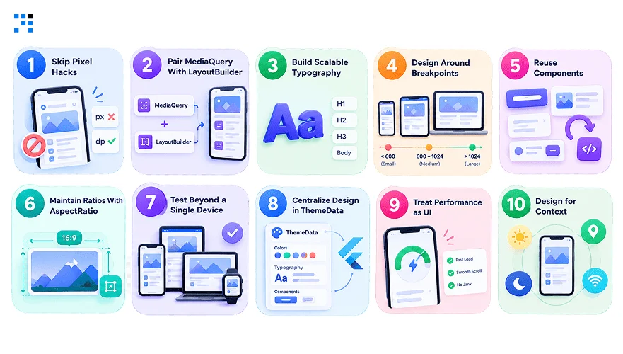
1. Skip Pixel Hacks
Hardcoded pixel values break the moment screen sizes change.
Widgets like Expanded and Flexible scale naturally instead.
Constant manual adjustment work gets removed entirely.
Teams save real hours that would otherwise go into device-specific patches.
2. Pair MediaQuery With LayoutBuilder
MediaQuery alone only reveals screen dimensions, nothing more.
LayoutBuilder adds real-time layout constraints on top of that.
Together, they let layouts respond with genuine precision.
This combination handles edge cases that MediaQuery alone always misses.
3. Build Scalable Typography
Text that’s readable on one device often breaks on another.
TextTheme centralizes font control across the entire app.
Pairing it with textScaleFactor adapts sizing for accessibility needs too.
That matters most in apps serving a wide range of ages and abilities.
4. Design Around Breakpoints
Screen widths vary wildly across phones, tablets, and desktops.
Defined breakpoints trigger layout shifts at the right moments.
The approach keeps every device feeling intentionally designed for.
Guesswork gets replaced with predictable, testable layout behavior.
5. Reuse Components
Copy-pasted layout code multiplies bugs across a growing app.
One reusable widget, built once, scales cleanly everywhere.
This keeps both the codebase and the UI consistent.
Updates also become far faster since changes only happen in one place.
6. Maintain Ratios With AspectRatio
Stretched images quietly damage an app’s perceived quality.
AspectRatio locks proportions regardless of screen size.
A single widget protects visual polish app-wide.
7. Test Beyond a Single Device
One phone or emulator hides real responsive design flaws.
Testing across small phones, tablets, and desktops catches issues early.
Physical device testing remains the most reliable check.
Bugs found here are far cheaper than bugs found post-launch.
8. Centralize Design in ThemeData
Manually setting colors and spacing in every widget doesn’t scale.
A centralized theme system keeps visual decisions consistent app-wide.
Larger teams especially benefit since everyone works from the same source.
9. Treat Performance as UI
A beautiful screen that lags still frustrates users immediately.
Efficient lists and cached images prevent stutter under load.
Speed is part of how design actually feels.
Users rarely separate “looks good” from “feels smooth.”
10. Design for Context
A food delivery app and a warehouse tool serve different needs.
Contextual UX accounts for gloves, lighting, and orientation.
Real-world use shapes decisions more than trends do.
The best design decisions come from watching actual users, not assumptions.
How UI/UX Improved Retention by 40% in a UPSC Prep App
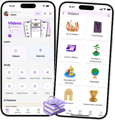
Self Study wanted to help UPSC aspirants prepare for one of India’s toughest exams,
but the learning experience lacked the structure and usability needed to keep users engaged.
They came to us to turn that vision into an app users could rely on.
Where Aspirants Were Struggling to Prepare
| Area | What Was Happening |
|---|---|
| Structured Learning | No clear path through subjects or syllabus |
| Doubt Resolution | Students had no real-time way to resolve doubts |
| Practice Tools | MCQs and flashcards existed nowhere in one place |
| Progress Tracking | Weak visibility into exam readiness |
What Changed After We Stepped In
We built the experience around a responsive UI/UX journey.
We chose Flutter for consistent UI across devices and faster development.
Subject discovery led into guided video learning, in one flow.
AI mentorship resolved doubts in real time, without leaving the app.
MCQ practice and flashcards closed the loop, right where users needed it.
Impact After Implementation
| Metric | Result |
|---|---|
| Structured Content Library | Coverage across every GS subject |
| Active Aspirants | 14,900+ learning on the platform |
| User Retention | 40% higher |
| Feature Visibility | Dedicated pages for AI mentor, MCQs, flashcards |
| App Downloads | 2X increase |
| Active User Growth | 12.3X |
The 40% retention gain came from connecting Flutter UI/UX elements, not adding more of them.
This is what a well-connected learning experience looks like when the loop actually works.
Want to know exactly how we built it for them?
How We Build Flutter Apps With Strong UI/UX
1. Responsive From Day One
Responsive design gets built into a project’s DNA from the very first sprint.
This avoids the endless redesign cycles teams face later.
Screens adapt cleanly whether they’re viewed on a phone or a tablet.
Clients avoid the rework costs that come from treating responsiveness as an afterthought.
2. Device Testing
Layouts get validated on actual phones and tablets, not just emulators.
Real-device testing catches responsive design flaws that theoretical testing misses.
What looks fine in Figma sometimes breaks in the real world.
Physical testing catches these gaps before real users ever do.
3. Design For Speed
Speed gets treated as part of the UI, not a separate concern.
Efficient widget trees and cached assets keep every screen fluid.
A fast app feels better designed, even with identical visuals.
That difference is often something users feel but can’t quite explain.
4. Custom Theme Systems
Every project starts with a centralized theme instead of scattered styling.
A centralized theme keeps larger teams aligned as more developers join later.
Visual consistency holds even as the app’s scope expands.
Design changes later also become faster and far less risky.
5. Industry-Specific UX Decisions
A logistics warehouse app and a fintech dashboard need different design logic.
Decisions get shaped by how, where, and by whom the app gets used.
That contextual thinking is what turns a functional app into one people actually trust.
It’s also what separates a generic build from one that fits a business precisely.
FAQs
If users drop off after their first few sessions, or your app store reviews mention layout or usability issues, that’s a strong signal. We usually run a UX audit early to pinpoint exactly where friction is costing you users.
Yes, when layout, speed, and usability improve together, users complete more actions like signups or purchases. Small fixes like clearer tap targets or faster load times often show measurable impact within weeks.
In most cases, yes, especially if the core logic is solid and only the UI layer needs work. We typically audit the existing app first to identify what can be improved versus rebuilt entirely.
Timelines depend on how much of the app needs rework, but a focused responsive design pass often takes a few weeks. We prioritize the screens with the highest user traffic first.
Yes, arguably more so, since B2B users often rely on the app for critical daily work. Our work with Self Study shows this clearly, a connected, well-designed experience directly drove a 40% retention increase.