Ever wondered why some apps feel trustworthy at first glance while others don’t? That instant feeling is a result of mobile app color psychology.
Every shade, tone, and contrast in your app design influences how users feel, trust, and interact with your product.
We’ve seen how the psychology of color in app design directly impacts engagement, retention, and conversions.
The right color palette can guide user actions, inspire emotions, and even drive purchase decisions.
In this blog, we’ll explore how color psychology influences user behavior in mobile app design. You’ll discover:
- The emotional science behind colors.
- How color choices affect user trust, attention, and loyalty.
- Practical tips to choose the right color palette for your app.
Let’s understand how colors change digital experiences and how you can use them to boost your app’s success.
What is Color Psychology & Why It Matters for Mobile Apps?
Color psychology is the study of how colors influence human emotions & behavior. Design helps us to understand how certain hues can make users feel calm, excited, confident, or cautious.
According to research, warm colors (like red and orange) often create feelings of excitement and urgency, while cool colors (like blue and green) promote trust and relaxation.
- The balance between warm and cool tones, along with contrast, affects how users interpret and react to what they see on their screens.
- In mobile app design, color is a strategic decision that can make or break user engagement.
- Every button, icon, or background shade plays a psychological role.
- For example, a calm blue screen can build confidence in a fintech app, while a bold red button can prompt immediate action.
We use app UI color psychology to design mobile interfaces that connect emotionally with users.
Understanding how color influences user behavior in apps helps to create experiences that convert better.
Learn about Top 10 UI/UX Mistakes That You Should Avoid.
The Emotional & Behavioral Power of Specific Colors
Choosing the right shades can transform user perception, while the wrong ones can drive them away. Let’s see what different colors communicate and how leading apps use them.
1. Red: Action, Attention & Urgency
- Red instantly grabs attention. It’s ideal for CTA buttons, alerts, or promotions because it triggers urgency and action.
- Think of how YouTube’s red play button draws you in; it’s psychology.
2. Blue: Trust, Calm & Professionalism
- Blue evokes security and reliability, perfect for finance, health, or productivity apps.
- We often recommend blue for apps that need to build instant user trust and loyalty.
3. Green: Growth, Success & Wellness
- Green represents balance and positivity.
- Health, fitness, and eco-friendly apps often use it to communicate freshness and progress (like the “success” or “completed” indicators).
4. Yellow & Orange: Optimism, Fun & Energy
- Yellow and orange are said to spark excitement and friendliness.
- They’re perfect for gamified or social platforms, especially during onboarding experiences where you want to make users feel welcomed & energized.
5. Purple, Black & White: Luxury, Minimalism & Clarity
- Purple adds elegance, black communicates sophistication, and white gives clarity and simplicity.
- Many premium apps and dark-mode interfaces rely on these colors for a refined user experience.
The color meaning in mobile app design plays a huge role in how users perceive and interact with your product.
Smart mobile app UX color choices mean higher engagement, satisfaction, and conversions.
Learn to Optimize Mobile App Performance.
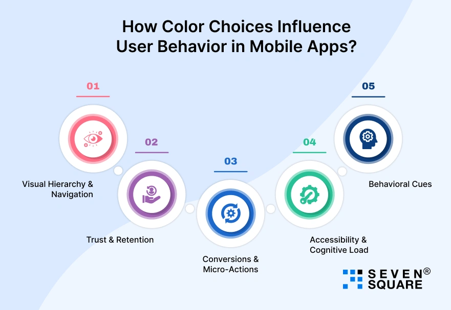
How Color Choices Influence User Behavior in Mobile Apps?

Colors are behavioral triggers. When used right, they guide navigation, improve clarity, and even build trust.
1. Visual Hierarchy & Navigation
- Colors define hierarchy.
- For example, a bright accent color on CTA buttons draws immediate attention, while muted backgrounds keep focus where it matters most.
2. Trust & Retention
- A consistent color scheme aligned with your brand voice helps users feel safe and familiar.
- That’s why fintech apps stick with blue; it subconsciously builds credibility and trust over time.
3. Conversions & Micro-Actions
- Contrasting button colors, like orange on a blue background, grab attention and prompt clicks.
- Small color tweaks often lead to measurable boosts in conversion rates.
4. Accessibility & Cognitive Load
- Poor contrast or oversaturated tones can cause fatigue or confusion.
- A balanced palette reduces cognitive load and makes your app accessible to everyone.
5. Behavioral Cues
- Think of color-based signals: a green tick for success, a red alert for error.
- These visual cues create instant understanding, so users don’t have to think twice.
We strategically plan how to choose colors for mobile app design based on psychology and behavior, ensuring every shade has purpose and meaning.
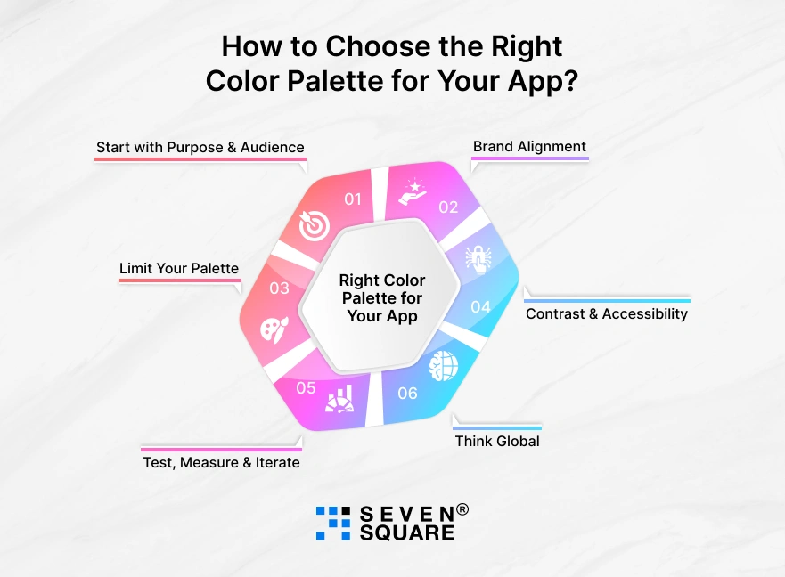
How to Choose the Right Color Palette for Your App?

Selecting your app’s colors is about purpose, emotion, and brand consistency. Here’s our simple framework to help you get it right:
1. Start with Purpose & Audience
- Ask yourself: What feeling should users have while using your app?
- For a health app, calm and safety; for a delivery app, speed and reliability. Your goals shape your palette.
2. Brand Alignment
- Your app’s colors must match your brand identity.
- Users should instantly connect the app’s visuals to your company’s personality and values.
3. Limit Your Palette
- Stick to a primary, secondary, and accent color. This prevents visual overload and keeps the interface clean and consistent.
4. Contrast & Accessibility
- Different devices display colors differently. Always check contrast ratios to ensure readability in both light and dark modes.
5. Test, Measure & Iterate
- Run A/B tests on different color schemes. See which combinations lead to more clicks, longer sessions, or higher conversions.
6. Think Global
- Colors don’t mean the same thing everywhere. Localize your palette if your app serves international users.
By applying color psychology for mobile apps, you can create a palette that looks stunning & also boosts engagement.
Test, learn, and refine, because that’s how you understand which colors boost user engagement in mobile apps via color psychology.
Color Psychology Checklist for Mobile App Success
Here’s a quick, actionable checklist to help developers & designers apply mobile app design color psychology effectively & create the best color palette for mobile app user engagement.
1. Define the Emotion & Action You Want from Users
- Every app color should make users feel something.
- Decide the emotion first: Do you want to build trust, excitement, or calm? The emotion you choose will guide your color direction.
2. Choose a Primary Palette Aligned with Brand & Purpose
- Your mobile app color psychology must connect to your brand identity.
- A fintech app may use blue for trust, while a fitness app might lean on green for growth. Keep your palette consistent with your message.
3. Map Colors to Key UI Elements
- Assign colors to specific roles, CTAs, icons, backgrounds, and notifications.
- Red for warnings, green for confirmations, and blue for informational actions create intuitive user behavior patterns.
4. Test on Real Devices & Check Accessibility
- Colors look different across devices. Always test your palette under various lighting conditions.
- High contrast ensures readability, especially for users with visual impairments.
5. Use Analytics to Track Color Performance
- Use app analytics to see how color changes affect conversions, clicks, or retention.
- A/B testing is the best way to understand how color influences user behavior in apps.
6. Iterate & Refine Over Time
- Keep improving your color palette using data insights, feedback, and behavioral metrics.
- Continuous refinement leads to a more personalized, high-performing app experience.
Our Expertise in Designing Apps That Emotionally Connect & Convert
Our design experts understand how color psychology influences user behavior and use it strategically to create a powerful user experience.
- Color Psychology Expertise: We use color emotion theory to create visuals that connect with your target audience and influence their purchase decisions.
- Data-Driven Design Choices: Every color palette we choose is backed by user testing and analytics to boost conversion rates and user retention.
- Behavior-Focused UI/UX Design: Our designers study how color impacts mood and behavior to design interfaces that inspire trust, curiosity, and action.
- Brand-Centric Approach: We ensure your app’s color scheme reflects your brand’s personality, whether it’s bold, trustworthy, or playful.
- Smooth Multi-Platform Experience: From iOS to Android, we maintain consistent color harmony to improve the overall user journey.
Want to Design Your Mobile App? Contact Us Now!
Your App’s Success Starts with the Right Colors
Color is one of the most powerful tools in mobile app design, and color psychology shows us why. Every hue shapes how users feel, trust, and interact with your app.
Your color palette is about making it meaningful for user behavior and is designed for engagement.
FAQs
- Color psychology in mobile app design is the study of how different colors influence how users feel and act while using an app.
- Blue creates trust, red grabs attention, and green promotes calmness, all of which impact user behavior and engagement.
- The best color palettes for mobile app user engagement depend on your app’s purpose and audience.
- Warm colors like red and yellow boost excitement and urgency, while cool colors like blue and green create trust and relaxation.
- Color psychology helps designers create emotional connections with users.
- The right color scheme improves UI/UX design, better readability, boosts conversions, and keeps users engaged longer.
- Use A/B testing to see how different color schemes affect user engagement, clicks, and conversions.
- You can also analyze mobile app analytics to check if color changes influence your metrics.