Did you ever go through an app and feel lost, or even uninstall it because it was too confusing? That’s because of mobile navigation design.
We’ve seen this pattern across many projects. When users can’t find what they’re looking for in a few taps, they leave.
According to research, 70% of users abandon an app if navigation feels complex or boring.
Good mobile navigation UX is about creating smooth paths that help users reach their goals without thinking.
From increasing engagement to improving retention and conversion rates, the way your users move through your app defines your success.
In this blog, you can learn which mobile navigation patterns actually work, which don’t, and what makes the difference between a delightful experience and a frustrating one.
Why Mobile Navigation Patterns Are the Backbone of User Experience?
Firstly, you need to understand what exactly mobile navigation patterns are.
These are design frameworks that help users move through an app. Think of them as the road signs and pathways that make sure no user gets lost.
Popular examples include bottom tabs, hamburger menus, side drawers, and gesture-based navigation.
But why are they so important? A clear mobile navigation UI ensures seamless user flow, reduces friction, and improves mobile app usability.
When users instantly understand where to tap or swipe, they stay longer and engage more.
The difference between desktop and mobile navigation patterns lies in how users interact with smaller screens, as mobile users rely on thumbs, gestures, and compact menus.
That’s why mobile-first UX design focuses on simplicity, visibility, and one-handed usability.
A well-structured navigation hierarchy (like bottom navigation for core sections and hidden menus for secondary options) helps achieve that perfect balance of clarity and space.
Learn more about Top 10 UI/UX Mistakes To Avoid.
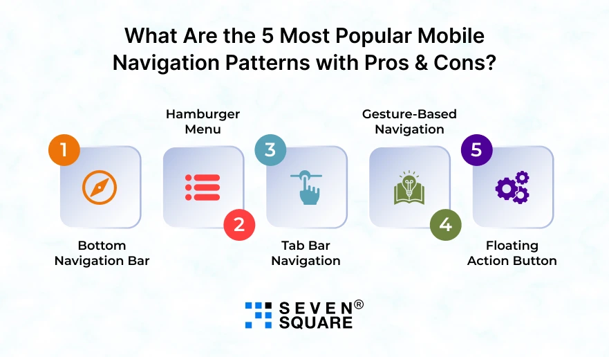
What Are the 5 Most Popular Mobile Navigation Patterns with Pros & Cons?

When it comes to designing a seamless mobile navigation experience, the right pattern can make all the difference.
We’ve experimented with dozens of layouts while building apps, and these five mobile navigation patterns examples stand out as the most common across industries.
1. Bottom Navigation Bar
This is one of the most widely used patterns in mobile apps & for good reason. It’s always easy to reach, & ideal for quick access to 3 to 5 main sections.
Pros:
- Perfect for one-handed use.
- Improves visibility of key features.
- Familiar to most users (used in Instagram, Spotify, WhatsApp).
Cons:
- It becomes cluttered if you add too many tabs.
In the bottom navigation vs hamburger menu debate, bottom navigation often wins for accessibility and discoverability.
2. Hamburger Menu
A classic choice that keeps the screen clean by hiding secondary options under a three-line icon.
Pros:
- Saves screen space.
- Ideal for complex apps with many features.
Cons:
- Hides important items, reducing engagement.
- Users may not explore hidden features.
While the hamburger menu looks minimal, overusing it can reduce visibility; it’s a common tradeoff in mobile navigation pros and cons.
3. Tab Bar Navigation
Tabs work well for apps with limited, well-defined sections, like music players or social apps.
Pros:
- Simple and intuitive.
- Allows quick switching between core features.
Cons:
- Limited space for sections.
- Not ideal for deep hierarchies.
Tab bars remain a go-to pattern in mobile navigation UI because they combine familiarity with simplicity.
4. Gesture-Based Navigation
This modern pattern focuses on swipes and gestures instead of visible buttons, which is perfect for immersive, full-screen experiences.
Pros:
- Feels natural and futuristic.
- Frees up screen space.
Cons:
- It can confuse older or less tech-savvy users.
- Requires learning and visual cues.
Gesture-based systems reflect innovation, but balance is key, as too many gestures can harm usability.
5. Floating Action Button (FAB)
That round, standout button you see in many apps (like Gmail’s “Compose”)? That’s a FAB.
Pros:
- Great for highlighting a primary action (like adding or creating).
- Visually engaging and quick to access.
Cons:
- It can overlap important content.
- Feels intrusive in certain layouts.
Used smartly, FAB improves usability, but overuse can lead to clutter.
What Are the Mobile Navigation Patterns That Users Love?
After testing countless designs across industries, we found that some mobile navigation patterns consistently win user trust and engagement.
Here’s what works and why users keep coming back to these best mobile navigation patterns.
1. Bottom Navigation Bar
- This remains the most effective navigation design for modern apps. It’s easy to reach, visually familiar, and keeps users oriented at all times.
- Apps like Instagram and Spotify use bottom navigation bars because they balance visibility with simplicity as a cornerstone of mobile navigation best practices.
2. Tab-Based Navigation
- Tabs make switching between main sections smooth.
- They’re especially effective when combined with icons and labels for better readability.
- For example, WhatsApp’s tab bar helps users jump between Chats, Status, and Calls without confusion.
They deliver effective navigation design through predictability.
We always follow mobile navigation best practices using familiar patterns, intuitive icons, and a consistent structure that makes users feel at home from the first tap.
Learn about Color Psychology’s Impact on Mobile App Design.
What Doesn’t Work (and Why Some Patterns Fail Miserably?)
Not every design decision leads to success. In fact, some mobile navigation mistakes can quietly kill your app’s engagement.
We’ve audited dozens of apps that struggled simply because of poor navigation UX choices. Here’s what to avoid:
1. Hidden Menus = Drop in Engagement
- When key options are tucked away in a hamburger menu, users overlook them.
- This “out of sight, out of mind” approach leads to low engagement.
2. Overcrowded Navigations = Decision Fatigue
- Cramming too many items into your navigation overwhelms users.
- They don’t know where to start, leading to frustration and drop-offs.
3. Poor Visual Hierarchy = Confusion
- When everything looks equally important, nothing stands out.
- Clear visual hierarchy helps guide the user journey naturally.
4. Gesture Overload = Inconsistent User Experience
- Relying solely on swipes and gestures can alienate users who expect visible cues.
- It’s one of the most common UX design errors we encounter.
Understanding why mobile navigation fails helps prevent costly redesigns later.
We fix these issues by simplifying the structure, emphasizing visibility, and testing every flow before deployment.
How to Choose the Right Navigation Pattern for Your App?
The best approach depends on how your users interact with your app. Here’s what to consider when deciding:
- App Complexity: Simpler apps benefit from tab bars, while complex apps might need drawers or segmented navigation.
- Target Audience: Younger audiences adapt to gesture-based designs, while older users prefer visible buttons.
- Content Hierarchy & Feature Depth: Prioritize essential features upfront and hide secondary options to avoid clutter.
- One-Handed Usability: Design for real-world use, as most users navigate with their thumb.
When you’re wondering how to choose the best mobile navigation pattern, create a simple decision matrix:
- If your app has up to 5 main features, then go with a bottom tab bar.
- If your app has multiple layers of content, then use a drawer or combination pattern.
Mobile app UX testing helps reveal how real users behave so you can fine-tune navigation usability before launch.
What Are the Next Mobile Navigation Trends?
The world of mobile navigation design is changing faster than ever. Gesture-based navigation and AI-based adaptive menus are becoming mainstream.
- Apps are moving toward context-aware navigation & menus that adjust automatically based on user behavior and preferences.
- Voice and motion-based navigation are emerging as accessibility boosters, helping users interact naturally without tapping.
- The future of mobile UX is about personalization and simplicity.
- The goal is no longer to add more features but to design smarter, modern navigation experiences that feel invisible yet powerful.
How Do We Help You Design Navigation That Converts?

We specialize in creating navigation that feels smooth because when users enjoy moving through your app, they stay longer and convert faster.
- UI/UX Audit for Existing Apps: We identify what’s confusing users and what’s working well.
- Data-Driven Navigation Redesign Strategies: Every change we make is backed by analytics and heatmaps.
- Prototyping & User Testing: We validate every design decision with real users to ensure intuitive flow.
- Conversion-Optimized Navigation: We build navigation that aligns with business goals that help startups and enterprises boost usability and ROI.
Want UI/UX Design Services? Contact Us Today!
Simplify, Don’t Complicate
The best mobile navigation design is the one that users prefer because it works.
Keep it clean, keep it simple, and always test it with real people. Every tap, swipe, and scroll should guide users smoothly toward their goal.
Remember: Good mobile app navigation UX tries to help.
FAQs
- The most common ones include bottom navigation bars, hamburger menus, tab bars, and gesture-based navigation, all part of popular mobile navigation patterns.
- For complex apps with deep hierarchies, side drawers or combination patterns work best to organize multiple sections efficiently.
- Both display primary sections, but tab navigation often includes icons and text, while bottom navigation focuses on main screens only.
- Keep it consistent, use familiar icons, and conduct mobile UX design testing to see how users actually interact.