When you’re displaying a large amount of data, whether it’s for an admin dashboard, pricing comparison, or analytics page, a regular table just doesn’t cut it.
Users often scroll and lose sight of what each column means.
That’s where a responsive table with a sticky header comes in.
A responsive table in HTML and CSS automatically adjusts to different screen sizes, making it mobile-friendly.
A sticky header table keeps the column titles visible while scrolling, making your content easier to read and navigate, especially on smaller screens or lengthy datasets.
Whether you’re a developer building a data table UI, an entrepreneur improving a SaaS dashboard, or a business enhancing internal tools, sticky headers in responsive tables are a must for better user experience and data readability.
Here you can get all the details about responsive HTML table sticky header and how you can create responsive table with html & css.
What Is a Sticky Header in HTML Tables?
A sticky header in an HTML table means the <thead> section stays fixed at the top of the container while the user scrolls through the table body.
This is achieved using a CSS property called position: sticky.
Why does this matter?
When you’re working with long lists like invoices, user data, or product inventories users shouldn’t have to scroll back up to see what a column represents.
That’s why using an HTML table with a fixed header makes the experience smoother.
With just a few lines of code using CSS position sticky on thead, you can lock the header row in place without any JavaScript. It’s clean, simple, and highly effective.
What Are the Responsive Design Challenges with HTML Tables?
Standard HTML tables were never designed to be mobile-friendly out of the box.
On smaller screens, users often have to deal with horizontal scrolling, misaligned columns, or broken layouts.
That’s because tables tend to overflow their containers unless styled properly.
A responsive HTML table solves this by making sure the table adapts to various screen sizes like desktop, tablet, & phone.
But even then, making both the table scrollable and the header sticky at the same time can be tricky.
Developers often run into issues where the sticky header doesn’t work due to container overflow, or where the scrollable table body behaves inconsistently.
That’s why mastering both a scrollable table body in CSS and responsive layout structure is crucial for building modern web UIs.
Learn to create responsive eCommerce website with HTML, CSS, and JS.
What is HTML Structure for a Responsive Table?
To build a HTML table with a sticky header, start by writing clean HTML with proper use of <thead> and <tbody>.
This structure separates the header from the data and sets the stage for applying CSS styling later.
Here’s a simple HTML structure to get started:
            <div class="table-container">
              <table class="responsive-table">
              <thead>
                <tr>
                  <th>Product</th>
                  <th>Price</th>
                  <th>Category</th>
                  <th>Stock</th>
                </tr>
              </thead>
              <tbody>
                <tr>
                  <td>Wireless Mouse</td>
                  <td>$25</td>
                  <td>Accessories</td>
                  <td>150</td>
                </tr>
                <tr>
                  <td>Keyboard</td>
                  <td>$45</td>
                  <td>Accessories</td>
                  <td>80</td>
                </tr>
                <!-- Add more rows as needed -->
              </tbody>
              </table>
            </div>
How to Add Sticky Header Using Only CSS (No JavaScript)?
Now let’s make the table header sticky using pure CSS only, no JavaScript is required.
By applying position: sticky to the <th> elements in the <thead>, you can keep the header fixed as you scroll.
Here’s the CSS you need:
            .responsive-table thead th {
              position: sticky;
              top: 0;
              background-color: #fff;
              z-index: 2;
              box-shadow: 0 2px 2px rgba(0,0,0,0.1);
            }
This approach creates a CSS-only table sticky header that works across modern browsers.
Make sure the table is not inside a container with overflow: hidden; or overflow: auto unless it’s required, as it can prevent position: sticky from working.
Tip: Always set a background-color on your sticky header to prevent overlap transparency.
How to Make the Table Responsive with CSS?
Next, let’s make sure the table is fully responsive.
We’ll wrap it inside a container that enables horizontal scrolling on smaller screens and ensure the table doesn’t break the layout.
Here’s how to do it:
            .table-container {
              width: 100%;
              overflow-x: auto;
            }

            .responsive-table {
              width: 100%;
              min-width: 600px;
              border-collapse: collapse;
            }
These styles help your responsive table (HTML CSS) fit well on all devices while preserving the sticky header.
A Complete Code Example: HTML + CSS
Now that we’ve built everything step by step, here’s the full code example you can copy and use right away.
            <!-- Responsive Table with Sticky Header -->
              <div class="table-container">
                <table class="responsive-table">
                <thead>
                  <tr>
                    <th>Product</th>
                    <th>Price</th>
                    <th>Category</th>
                    <th>Stock</th>
                  </tr>
                </thead>
                <tbody>
                  <tr>
                    <td>Wireless Mouse</td>
                    <td>$25</td>
                    <td>Accessories</td>
                    <td>150</td>
                  </tr>
                  <tr>
                    <td>Keyboard</td>
                    <td>$45</td>
                    <td>Accessories</td>
                    <td>80</td>
                  </tr>
                  <tr>
                    <td>HD Monitor</td>
                    <td>$150</td>
                    <td>Displays</td>
                    <td>45</td>
                  </tr>
                  <tr>
                    <td>Webcam</td>
                    <td>$60</td>
                    <td>Accessories</td>
                    <td>35</td>
                  </tr>
                </tbody>
                </table>
              </div>
           <style>
              .table-container {
                width: 100%;
                overflow-x: auto;
              }

              .responsive-table {
                width: 100%;
                min-width: 600px;
                border-collapse: collapse;
              }

              .responsive-table th,
              .responsive-table td {
                padding: 12px 15px;
                border: 1px solid #ccc;
                text-align: left;
              }

              .responsive-table thead th {
                position: sticky;
                top: 0;
                background-color: #f9f9f9;
                z-index: 2;
                box-shadow: 0 2px 2px rgba(0, 0, 0, 0.1);
              }
              </style>
This example gives you a HTML table with fixed header and scrollable body while staying responsive and clean.
It’s ideal for dashboards, reports, product listings, and internal admin panels.
You can find the responsive table code on GitHub for faster implementation.
Why Choose Seven Square to Build Your Responsive HTML Tables with Sticky Headers?

At Seven Square, we specialize in building clean, scalable, and responsive HTML tables with sticky headers according to your business needs.
Whether you’re managing large data sets, admin dashboards, or customer reports, we deliver performance-focused UI components that work seamlessly across all devices.
Here’s how we help you build it right:
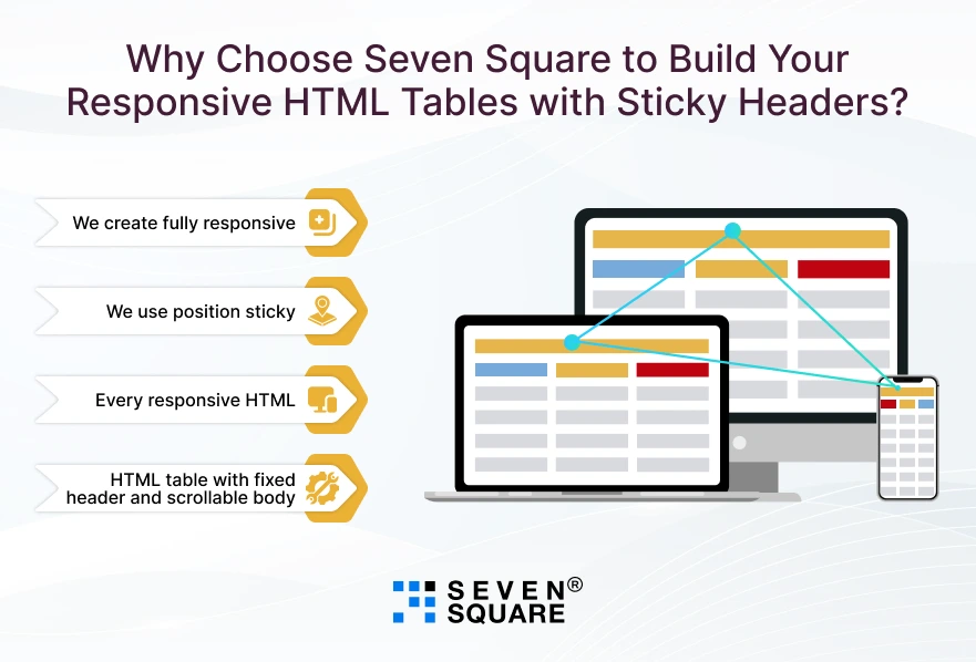
- We create fully responsive HTML tables using clean code and modern CSS that adjusts perfectly across mobile, tablet, and desktop.
- We use position: sticky smartly to create sticky header tables in CSS without any external libraries or JavaScript.
- Every responsive HTML table we build is optimized for fast loading, smooth scrolling, and high user engagement.
- We make sure your HTML table with fixed header and scrollable body works across Chrome, Safari, Firefox, and Edge.
Want to Get Custom Web Solution? Contact Us Now!
How to Make It Look Good with CSS Styling Tips?

Once your responsive table and sticky header are working, it’s time to make them visually appealing and easier to interact with.
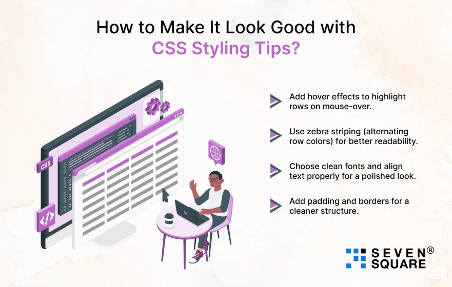
Here are some quick tips to enhance your responsive HTML table design:
- Add hover effects to highlight rows on mouse-over.
- Use zebra striping (alternating row colors) for better readability.
- Choose clean fonts and align text properly for a polished look.
- Add padding and borders for a cleaner structure.
Great design isn’t just about looks but it boosts usability. A table that’s both responsive and styled well encourages users to stay longer and interact more with your data.
FAQs
- To create a responsive table in HTML and CSS, wrap your <table> inside a container with overflow-x: auto; and give the table min-width.
- This ensures horizontal scrolling on smaller screens without breaking layout.
- A sticky header is a table <thead> row that stays fixed at the top while scrolling through the table content.
- It’s implemented using the CSS rule position: sticky; top: 0;, improving readability in long data tables.
- Yes, you can create a CSS-only table with sticky header using position: sticky on <thead> th .
- No JavaScript is needed if your table and container are structured correctly.
- Use min-width, padding, and horizontal scroll containers.
- Also apply CSS styling like zebra striping, font size adjustments, and row spacing.
- This improves your responsive HTML table design for smaller screens.