Dynamic theming in Flutter has become a user expectation.
With the growing popularity of light/dark mode switches, users want more control over how an app looks and feels.
Whether you’re building a B2C app, a dashboard for clients, or a startup MVP, supporting both light & dark themes improves personalization, accessibility, & overall user satisfaction.
Adding a theme toggle at runtime lets users switch instantly between light and dark modes without restarting the app.
This kind of flutter dynamic theming can reduce eye strain, align with system preferences, and make your app feel more modern and responsive.
In this blog, you’ll learn how to implement a runtime theme switch in Flutter using a simple toggle, complete with working code and a GitHub repo that you can use.
What Is Dynamic Theming in Flutter?
Dynamic theming in Flutter allows your app to adapt its look and feel while it’s running, meaning users can switch from a light to a dark theme (or vice versa) without restarting the app.
This is done using ThemeData and ThemeMode, two powerful features built into the Flutter framework.
Here’s how it works:
- ThemeData.light() and ThemeData.dark() define your themes.
- ThemeMode lets you control whether the app follows the light theme, dark theme, or system preference.
Static themes are fixed when the app starts. But with the flutter light dark theme toggle, you can change themes on the fly based on user actions or saved preferences.
Apps like Reddit, Twitter, and Instagram already use dynamic theming to enhance user experience, and now, you can too with flutter theme switch at runtime.
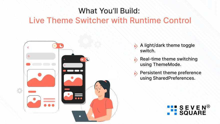
What You’ll Build: Live Theme Switcher with Runtime Control

In this blog, you’ll build a fully working Flutter app that includes:
- A light/dark theme toggle switch.
- Real-time theme switching using ThemeMode.
- Persistent theme preference using SharedPreferences.
You can explore the flutter theme switcher code in the GitHub repository and customize it for your projects.
The goal is to create a robust theme toggle GitHub template you can reuse across multiple Flutter apps.
What Are the Theme Basics? Light, Dark, and ThemeMode in Flutter
Before exploring the code, let’s understand the basics of Flutter theming:
- ThemeData.light(): Defines the default light appearance of your app.
- ThemeData.dark(): Provides a dark mode with lower brightness and contrast adjustments.
- ThemeMode.light: Forces the app to always use the light theme.
- ThemeMode.dark: Forces the app to always use the dark theme.
- ThemeMode.system: Automatically adapts the app theme to the device’s current system settings.
Project Setup: Start Your Dynamic Flutter Theme App
To begin this flutter dynamic theming tutorial with code, make sure your Flutter SDK is up to date.
Flutter Version:
- Flutter 3.22.1 or above
Required Packages:
Add these to your pubspec.yaml:
dependencies:
flutter:
sdk: flutter
provider: ^6.1.1
shared_preferences: ^2.2.2
Folder Structure:
Organize your project for scalability:
lib/
│
├── main.dart
├── theme/
│ ├── theme_provider.dart
│ └── themes.dart
└── screens/
└── home_page.dart
This structure helps scale your app while keeping your flutter dynamic theming clean and modular.
UI Toggle: Build the Theme Switcher
Now let’s add a toggle button so users can switch between light and dark themes in Flutter at runtime.
Switch Widget in home_page.dart:
            import 'package:flutter/material.dart';
            import 'package:provider/provider.dart';
            import '../theme/theme_provider.dart';
            class HomePage extends StatelessWidget {
              @override
              Widget build(BuildContext context) {
              final themeProvider = Provider.of(context);

              return Scaffold(
                appBar: AppBar(title: Text("Theme Switcher")),
                body: Center(
                  child: SwitchListTile(
                    title: Text('Enable Dark Theme'),
                    value: themeProvider.isDarkMode,
                    onChanged: (value) => themeProvider.toggleTheme(),
                  ),
                ),
              );
              }
            }
This UI component provides a clean flutter toggle switch UI to change the theme instantly.
Save User Theme Preference with SharedPreferences
We want to persist the theme selection across app restarts using SharedPreferences.
Theme Provider: theme_provider.dart
            import 'package:flutter/material.dart';
            import 'package:shared_preferences/shared_preferences.dart';

            class ThemeProvider with ChangeNotifier {
              bool _isDarkMode = false;

              bool get isDarkMode => _isDarkMode;
              ThemeMode get themeMode => _isDarkMode ? ThemeMode.dark : ThemeMode.light;

              ThemeProvider() {
              loadThemePreference();
              }

              void toggleTheme() {
              _isDarkMode = !_isDarkMode;
              saveThemePreference();
              notifyListeners();
              }

              void loadThemePreference() async {
              final prefs = await SharedPreferences.getInstance();
              _isDarkMode = prefs.getBool('isDarkMode') ?? false;
              notifyListeners();
              }

              void saveThemePreference() async {
              final prefs = await SharedPreferences.getInstance();
              prefs.setBool('isDarkMode', _isDarkMode);
              }
            }
Load on Startup: main.dart
           void main() {
              runApp(
              ChangeNotifierProvider(
                create: (_) => ThemeProvider(),
                child: MyApp(),
              ),
              );
            }
With this, you’ve implemented flutter theme switch with shared preferences and runtime theme persistence Flutter.
Use Provider or Riverpod for Scalable Theme Management (Optional)
For large-scale apps, proper state management is important.
Using Provider:
Already shown above using ChangeNotifier.
Using Riverpod (optional advanced):
           final themeProvider = StateNotifierProvider<ThemeNotifier, ThemeMode>(
              (ref) => ThemeNotifier(),
            );

            class ThemeNotifier extends StateNotifier<ThemeMode> {
              ThemeNotifier() : super(ThemeMode.system);

              void toggleTheme() {
              state = state == ThemeMode.dark ? ThemeMode.light : ThemeMode.dark;
              }
            }
This setup gives you scalable, custom theme Flutter management for enterprise-grade apps.
Choose flutter dynamic theming provider for quick setups, and Riverpod for complex use cases.
Code Example: From Theme Switch to Persistence
Here’s your flutter theme switcher code, copy, paste, and run:
main.dart
           void main() {
              runApp(
              ChangeNotifierProvider(
                create: (_) => ThemeProvider(),
                child: MyApp(),
              ),
              );
            }
            class MyApp extends StatelessWidget {
              @override
              Widget build(BuildContext context) {
              final themeProvider = Provider.of<ThemeProvider>(context);
              return MaterialApp(
                theme: ThemeData.light(),
                darkTheme: ThemeData.dark(),
                themeMode: themeProvider.themeMode,
                  home: HomePage(),
              );
              }
            }
Here’s the Complete Code for Dynamic Theming in Flutter between Light & Dark.
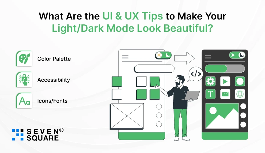
What Are the UI & UX Tips to Make Your Light/Dark Mode Look Beautiful?

Great theming isn’t just about switching colors, it’s about experience.
Pro Tips:
- Color Palette: Use ColorScheme.fromSeed() for consistent colors.
- Accessibility: Check contrast using tools like contrast-ratio.
- Icons/Fonts: Use Theme.of(context).iconTheme.color to match icons with theme.
          ThemeData darkTheme = ThemeData(
            brightness: Brightness.dark,
            colorScheme: ColorScheme.dark(
            primary: Colors.tealAccent,
            background: Colors.black,
            ),
          );
These tips create a customizable Flutter theme that feels smooth and professional in both modes.
Want a Fully-Featured Flutter App? Contact Us Now!
How to Troubleshoot the Common Issues?
Facing issues with your flutter theme toggle? Here’s help:
| Problem | Solution |
| Theme not updating | Ensure notifyListeners() is called. |
| SharedPreferences not saving | Use await prefs.setBool() correctly. |
| Hot reload not applying theme | Try hot restart or rebuild the widget tree. |
| Dark mode not working on emulator | Check device theme settings or switch to a physical device. |
Solve flutter dark mode not working and theme switch not applying with these simple fixes.
Build Smarter UIs with Dynamic Themes
Now you have built a Flutter app that supports light and dark themes at runtime using a simple toggle, complete with persistent settings.
You now understand how flutter runtime theme switching works, how to structure ThemeData, and how to implement a flutter light dark theme toggle using Provider or SharedPreferences.
This feature may seem small, but it adds huge value to your app’s UX.
You can now apply these concepts to any mobile app you build, whether it’s for clients, internal dashboards, or the next big product.
Fork the GitHub repo, play with different color palettes, and experiment with new layouts that suit both themes.
FAQs
- Flutter dynamic theming allows your app to switch between light and dark mode (or any custom theme) at runtime, based on user interaction or system settings.
- It improves user personalization and accessibility.
- You can add a Switch widget in your UI and connect it with a state management tool like Provider.
- On toggle, update the theme state and use notifyListeners() to reflect the change.
- Yes, use ThemeMode.system in your MaterialApp.
- Flutter will automatically apply a light or dark theme based on the device’s system preference.
- Yes, you can create a customizable Flutter theme by defining your own ThemeDatafor light and dark modes. Customize primary colors, typography, icon themes, and more.