If you’re planning to build an ecommerce website from scratch, there’s one thing you absolutely can’t ignore in 2025 is responsiveness.
With over 50% of online shopping happening on mobile devices, users expect your site to load fast, look good, and function perfectly on every screen size.
A responsive ecommerce website not only improves user experience but also improves your chances of ranking higher on Google.
In fact, search engines now prioritize mobile-friendly sites in their results.
In this blog, you’ll learn how to create a responsive ecommerce website from scratch using HTML, CSS, and JavaScript with zero external libraries.
Whether you’re a developer building a portfolio project or a business owner wanting a lightweight, custom online store, this tutorial is for you.
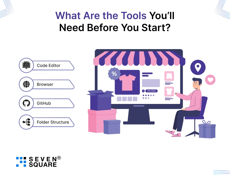
What Are the Tools You’ll Need Before You Start?

Before you dive into coding your ecommerce website with HTML, CSS, and JS, make sure you have the right setup. Here’s a simple list to get you started:
- Code Editor: Use Visual Studio Code (VS Code) for writing and organizing your code efficiently.
- Browser: Google Chrome is perfect for testing, especially using Chrome DevTools to inspect and debug your responsive layouts.
- GitHub: Use GitHub for version control and to host and share your project with the world.
- Folder Structure: Create a clean folder setup with directories like /images, /css, and /js for better file organization and scalability.
Getting these basics right will help you stay productive and avoid future bugs.
What Are the Common Mistakes to Avoid When Building Responsive Ecommerce Website from Scratch?
Even if you’re experienced in front-end development, there are a few mistakes that can sneak in while building your responsive ecommerce website from scratch:
- Forgetting responsive breakpoints: Your layout might look great on desktop but completely break on mobile. Use media queries early and test often.
- Using inline styles instead of external CSS: This limits scalability and makes your code harder to maintain or debug.
- Neglecting alt tags and SEO markup: Images without alt attributes and pages without meta tags can reduce accessibility and harm your SEO performance.
Avoiding these mistakes will ensure your website performs well across all devices and ranks better on Google.
Project Structure and File Setup to Build Responsive Ecommerce Website
To start building your ecommerce website template using HTML, CSS, and JS, we first need a clean folder structure.
This not only keeps things organized but also makes your project scalable.
Folder Structure
Create a main project folder with the following directories:
/ecommerce-website/
├── index.html
├── /css/
│ └── style.css
├── /js/
│ └── script.js
├── /images/
This setup helps you manage your files better and keeps the structure similar to professional ecommerce website templates (HTML CSS JS).
Boilerplate HTML (index.html)
            <!DOCTYPE html>
            <html lang="en">
            <head>
              <meta charset="UTF-8" />
              <meta name="viewport" content="width=device-width, initial-scale=1.0" />
              <title>Responsive Ecommerce Website </title>
              <link rel="stylesheet" href="css/style.css" />
            </head>
            <body>
              <script src="js/script.js"></script>
            </body>
            </html>
Copied!
What is HTML Layout for Building the Foundation of the Storefront?
Now let’s build the ecommerce website from scratch using semantic HTML. This layout will include a header, hero section, product cards, and a footer.
HTML Structure (add inside <body>)
           <!-- Header -->
                <header>
                  <div class="logo">ShopNow</div>
                  <nav>
                  <ul class="nav-links">
                    <li><a href="#">Home</a></li>
                    <li><a href="#">Products</a></li>
                    <li><a href="#">Cart</a></li>
                  </ul>
                  <button class="menu-toggle">☰</button>
                  </nav>
                </header>

                <!-- Hero Section -->
                <section class="hero">
                  <h1>Shop the Latest Deals</h1>
                  <p>Trendy, responsive, and fast-loading products.</p>
                  <a href="#products" class="btn">Start Shopping</a>
                </section>

                <!-- Product Grid -->
                <section id="products" class="product-grid">
                  <div class="product-card">
                  <img src="images/product1.jpg" alt="Product 1" />
                  <h3>Product 1</h3>
                  <p>$19.99</p>
                  <button class="add-to-cart">Add to Cart</button>
                  </div>
                  <!-- Repeat for more products -->
                </section>

                <!-- Footer -->
                <footer>
                  <p>© 2025 ShopNow. All rights reserved.</p>
                </footer>
Copied!
How to do CSS Styling to Make the Ecommerce Website Responsive?
Next, we’ll style everything using Flexbox, CSS Grid, and media queries. This section acts as a mini responsive ecommerce website design tutorial.
style.css
            &/* CSS Reset */
              * {
                margin: 0;
                padding: 0;
                box-sizing: border-box;
              }

              /* Variables */
              :root {
                --primary-color: #ff6f61;
                --text-color: #333;
              }

              /* General Styles */
              body {
                font-family: Arial, sans-serif;
                color: var(--text-color);
                line-height: 1.6;
              }

              /* Header */
              header {
                display: flex;
                justify-content: space-between;
                align-items: center;
                padding: 20px;
                background: #f4f4f4;
              }
              .nav-links {
                display: flex;
                gap: 20px;
              }
              .menu-toggle {
                display: none;
              }

              /* Hero Section */
              .hero {
                text-align: center;
                padding: 40px 20px;
                background: #e0f7fa;
              }
              .hero .btn {
                background: var(--primary-color);
                color: #fff;
                padding: 10px 20px;
                text-decoration: none;
                border-radius: 5px;
              }

              /* Product Grid */
              .product-grid {
                display: grid;
                grid-template-columns: repeat(auto-fit, minmax(220px, 1fr));
                gap: 20px;
                padding: 40px;
              }
              .product-card {
                border: 1px solid #ccc;
                padding: 20px;
                text-align: center;
              }

              /* Footer */
              footer {
                text-align: center;
                padding: 20px;
                background: #f4f4f4;
              }

              /* Responsive Breakpoints */
              @media (max-width: 768px) {
                .nav-links {
                display: none;
                }
                .menu-toggle {
                display: block;
                }
              }
Copied!
How to Handle JavaScript Interactions (Cart, Menu Toggle, etc.)?
Add simple interactivity using JavaScript for cart and mobile menu that are essential features in any ecommerce website using HTML CSS JS.
script.js
            // Toggle mobile menu
              document.querySelector(".menu-toggle").addEventListener("click", () => {
                document.querySelector(".nav-links").classList.toggle("show");
              });

              // Add to cart logic
              let cartCount = 0;
              document.querySelectorAll(".add-to-cart").forEach(button => {
                button.addEventListener("click", () => {
                cartCount++;
                alert(`Item added! Cart count: ${cartCount}`);
                });
              });
Copied!
Here’s a Complete Code to build Responsive Ecommerce Website.
Why You Should Choose Seven Square to Build Your Responsive Ecommerce Website?
We create high-converting, fully responsive ecommerce websites that are fast, user-friendly, and optimized for all devices.
We’ve helped global clients build ecommerce websites from scratch using HTML, CSS, JS, and modern frameworks.
We also followed the best practices in UI/UX, mobile responsiveness, SEO, and performance.
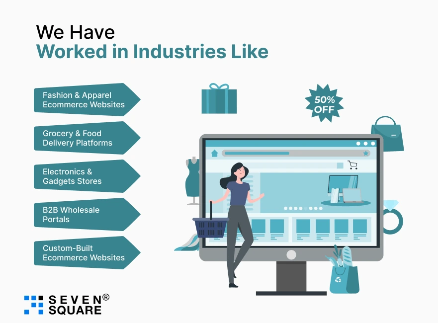
We Have Worked in Industries Like:

- Fashion & Apparel Ecommerce Websites: Smooth & mobile-first shopping experiences with dynamic product galleries and wishlist features.
- Grocery & Food Delivery Platforms: Fast-loading responsive layouts with live cart, geo-location, and payment integration.
- Electronics & Gadgets Stores: Clean templates with advanced filtering, product comparison, and customer reviews.
- B2B Wholesale Portals: Responsive ecommerce website templates customized for bulk orders, quotations, and dealer logins.
- Custom-Built Ecommerce Websites: Whether you need a minimalist store with plain HTML, CSS & JS or a scalable PWA, we’ve done it all.
Ready to build a responsive ecommerce website? Contact Us Now!
FAQs
- A responsive ecommerce website is a shopping site that automatically adjusts its layout, content, and elements to fit all screen sizes including mobile, tablet, and desktop.
- It ensures smooth user experience, faster loading, and higher conversions across devices.
- You can build an ecommerce website from scratch using just HTML, CSS, and JavaScript.
- Start with basic file structure, design the layout with HTML, style with responsive CSS, and use JavaScript to add interactivity like cart buttons and navigation toggles.
- Use media queries, flexbox, and CSS grid to adapt your layout to different screen sizes.
- Test your website across multiple devices or use browser DevTools’ device emulation to ensure responsiveness.
- Yes, the provided HTML, CSS, and JS ecommerce website template is open-source and beginner-friendly.
- You can use it for personal, learning, or small business projects.
- For large-scale commercial use, we recommend customizing it with the help of our team.