Have you ever closed an app just because it took too long to load? A study shows that every extra second of wait time increases bounce rates and lowers user satisfaction.
What most brands miss is that loading screens are emotional experiences.
We believe loading states are one of the most overlooked yet powerful tools in user experience (UX) design.
A well-thought-out loading screen UX can turn frustration into anticipation and keep users engaged even during delays.
That’s where smart loading state design comes in & using visuals, micro-interactions, and meaningful progress indicators to make users feel like things are moving faster, even if the actual time remains the same.
This idea is known as perceived performance, and it matters more than real speed.
Users care about how long the wait feels. If your app feels fast and engaging, users stay longer, interact more, and trust your product.
In short, smart loading states = better engagement, stronger retention, and higher ROI.
Here you will learn about the importance of user engagement during loading and how to implement smart loading states.
How Loading States Are More Than Just Spinners?
When users open your website or app, what happens before the main content appears?
That’s your loading state, a temporary experience that bridges the gap between nothing happening and everything working smoothly.
We treat loading states as an important part of user experience design. They communicate progress, build trust, and help reduce anxiety during wait times.
- Loading state: The system is fetching or processing data.
- Idle state: The system is ready but waiting for user action.
- Interactive state: The user is fully engaged with the interface.
Smart UX decisions make a difference. When you compare a spinner vs a progress bar, the progress bar performs better as it provides a sense of movement & completion.
And then there are skeleton screens, grey placeholders that preview the layout while content loads.
They are one of the best loading screen UX techniques because they mimic real content, giving users a visual cue that progress is happening.
In short, perceived performance is all about creating the feeling of speed.
Psychology Behind Wait Times: Why Users Quit (and How to Stop It)?
Understanding why users abandon apps during loading starts with understanding human psychology.
When people wait without feedback, their attention drops and frustration rises.
- Uncertainty: “Is this even working?”
- Boredom: Nothing’s happening; users start to lose interest.
- Frustration: Repeated waits make users less likely to return.
The trick is in feedback loops that give users continuous updates or visual progress cues.
Simple things like showing a progress indicator, a micro-animation, or a message like “Almost there…” can reduce anxiety and increase user engagement during loading.
Users stay patient because they understand what’s happening and trust that progress is being made.
In short, a smart loading design keeps users emotionally connected, reduces drop-offs, and builds long-term loyalty, all while your system quietly loads in the background.
Learn to Design for Different Screen Sizes.
What Are the Smart Loading State Design Strategies That Work?

With the right loading state design, you can make that “wait” feel engaging, smooth, and even delightful.
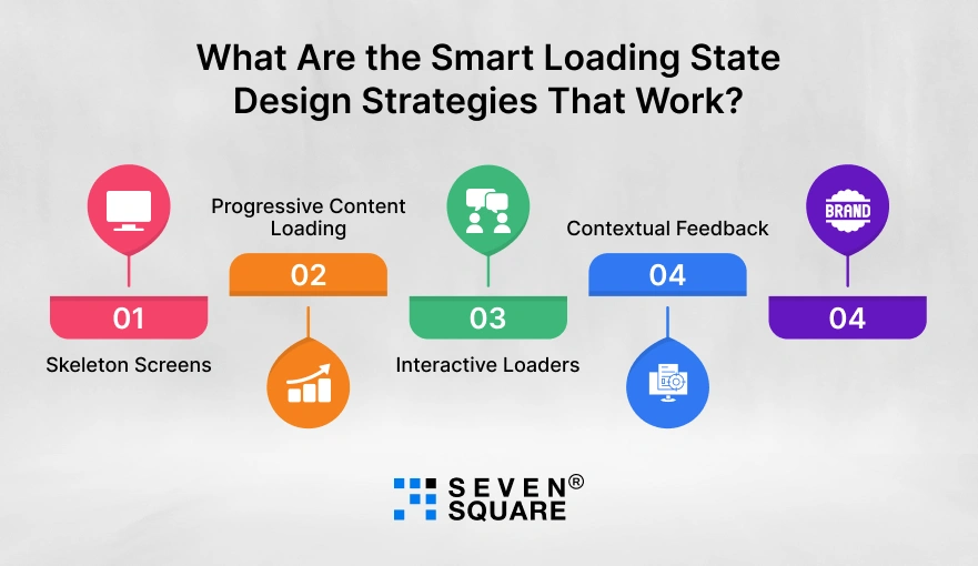
Here are five smart loading state design strategies that work & help your app feel faster, look smarter, and keep users engaged every second.
1. Skeleton Screens: Trick the Brain Into Thinking the App Is Faster
- A skeleton screen UX shows a placeholder version of your layout while content loads.
- It makes users believe progress is happening instantly & reduces perceived waiting time.
- Instead of staring at a blank screen, users see your app’s structure coming alive.
- Platforms like LinkedIn and Facebook use this technique to boost perceived performance and keep engagement high.
- We always recommend skeleton screens for apps or websites with heavy data or image loading to improve the loading state design & retain users.
2. Progressive Content Loading: Show Partial Info First
- Why make users wait for everything to load at once?
- With progressive content loading, you can display key elements first, like text or previews, while the rest continues loading in the background.
- This method makes your app feel faster and keeps users scrolling even as content is being fetched.
- It’s a simple trick to improve perceived performance and smooth overall user experience.
3. Interactive Loaders: Add Micro-Interactions or Mini-Games
- Boring loaders are out. Today, brands use micro-interactions during loading to add fun, feedback, and energy to the process.
- These small animations or playful moments (like Duolingo’s quirky owl animations) make users smile and stay engaged.
- Interactive loaders not only entertain but also create an emotional connection, turning “waiting time” into “experience time.”
- We love using micro-interactions that align with your brand’s tone: Subtle, useful, and human.
4. Contextual Feedback: Tell Users What’s Happening
- Uncertainty kills engagement. That’s why contextual feedback is key.
- Simple messages like “Fetching your data…” or “Almost there…” reassure users that progress is happening.
- Adding feedback during loading states helps reduce frustration and keeps users engaged by showing transparency.
- It’s one of the easiest yet most overlooked UX design practices that can significantly boost trust and satisfaction.
5. Branded Animations: Show Your Brand Personality During Wait Times
- With branded animations, you can showcase your logo, mascot, or motion identity in a way that reflects your company’s personality.
- Think of Google’s colorful dots or Slack’s cheerful loader, simple, recognizable, and friendly.
- We design branded loaders that make your wait screens unforgettable, helping users associate your brand with quality and care.
A great loading state design builds connection, sets tone, and keeps users engaged throughout the journey.
Understand the Importance of Mobile Navigation Patterns.
What Are the Real-World Apps That Nailed Loading State Design?
These examples prove that smart loading screen UX is a business advantage that improves engagement and user retention.
1. LinkedIn: Skeleton Loaders That Improve Perceived Speed
- LinkedIn uses skeleton screens to show placeholders for profiles and posts while data loads.
- This skeleton screen UX technique tricks users into feeling that the content is improving perceived performance.
- It’s one of the best loading screen UX examples showing that psychology matters as much as technology.
2. Duolingo: Fun Loading Animations That Keep Users Hooked
- Duolingo’s cheerful owl animations are a perfect example of micro-interactions during loading.
- Instead of static screens, users enjoy playful, branded moments that keep them smiling and waiting patiently.
How to Implement Smart Loading States? (For Designers & Developers)
Designing smart loading states is about creating a flawless experience that improves perceived performance and improves the wait time user experience.
Our approach combines creativity, psychology, and technology to ensure that users enjoy the journey, even while waiting.
Tips for UI Designers
When it comes to loading state design tips, every pixel counts. Here’s what our design team focuses on:
- Maintain visual hierarchy: Keep essential information visible first so users always feel oriented.
- Ensure motion consistency: Use animations that match your brand’s tone and app flows smoothly.
- Apply color psychology: Use calm tones (like blues or neutrals) for reassurance, or brand colors for engagement.
- Use skeleton screens: Guide the eye with structured placeholders that improve perceived performance instantly.
A thoughtful design not only makes your wait time user experience pleasant but also strengthens your brand identity.
Tips for Developers
A designer’s vision works best when developers build it efficiently. Our developers follow these best practices:
- Async loading: Load only what’s needed immediately and defer the rest.
- Caching: Store frequently used data locally to avoid repeated loading delays.
- Lazy loading: Render content progressively so users can start interacting faster.
- Preloading assets: Prepare important visuals or data before they’re requested, reducing perceived wait.
These backend optimizations reduce lag and ensure smooth transitions, key factors in improving loading state performance and overall UX.
Learn How Color Psychology Influence User Behavior in Mobile App Design.
How Do We Build Engaging Loading Experiences?

We treat loading screens as a powerful moment to connect with users and improve app engagement.
Our team combines UX design expertise with performance engineering to create loading experiences that not only look good but feel fast.
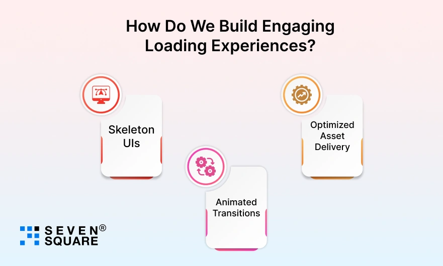
- Skeleton UIs: We use structured placeholders that instantly make apps feel faster and improve perceived performance.
- Animated Transitions: Smooth animations create continuity between screens and reduce cognitive load.
- Optimized Asset Delivery: We compress, cache, and lazy-load assets to ensure faster display without compromising quality.
This three-layered strategy helps clients achieve better retention, smoother UX, and higher app engagement, even under heavy load conditions.
Want A Custom Solution with Smart Loading States? Contact Us Today!
Turn Wait Time Into Engagement Time
Instead of seeing loading as an obstacle, treat it as an opportunity to engage.
With smart loading states, you can:
- Keep users calm and informed.
- Build trust through transparent feedback.
- Reinforce your brand personality.
Remember: Smart loading states = better retention + stronger brand recall.
FAQs
- A good loading state is clear, interactive, and branded. It reduces user anxiety and improves perceived app performance.
- Use skeleton screens, micro-interactions, and contextual feedback to keep users informed and engaged during loading.
- Long or unclear loading screens cause frustration and uncertainty. Good UX design solves this through feedback and animations.
- Skeleton screens perform better because they give users a sense of progress and make the app feel faster.