Your product is amazing, your pricing is competitive, and your ads are bringing visitors to your website. But people leave your site within just five seconds. Why?
The truth is, UI/UX design mistakes are silently killing your conversions.
Poor navigation, cluttered visuals, and confusing call-to-actions make users abandon even the best offers.
These design flaws hurt sales & also damage your brand’s trust and user engagement.
We’ve seen businesses lose thousands of potential leads simply because of subtle UI UX design mistakes killing conversions, mistakes that often go unnoticed.
In this blog, you will learn about the top 10 conversion-killing UI/UX mistakes you might not even realize you’re making & how to fix them before they cost you more customers.
What Makes UI/UX So Important for Conversion Rates?
Your website or app might look stunning, but if users can’t find what they need or complete an action easily, you’re losing conversions.
That’s where UI/UX conversion rate optimization comes in.
- UI (User Interface) is what users see: Your layout, colors, fonts, and buttons.
- UX (User Experience) is what users feel: How smoothly they can navigate, interact, and complete a goal.
Even the smallest friction in UI or UX can push users away. In fact, a one-second delay in load time can drop conversions by 7%, according to studies.
We focus on building experiences that guide users naturally toward conversion & turning first-time visitors into loyal customers.
Explore Top 10 Flutter UI/UX Tips.
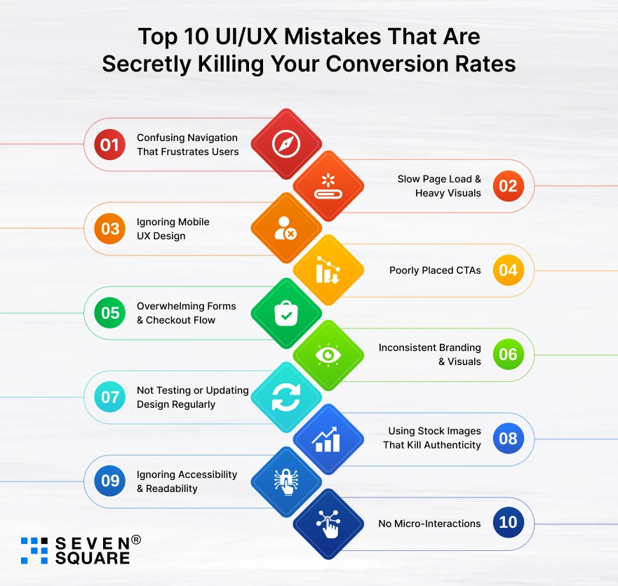
Top 10 UI/UX Mistakes That Are Secretly Killing Your Conversion Rates

We’ve audited hundreds of websites and apps, and most conversion problems don’t come from marketing or pricing.
They come from small UI/UX mistakes that quietly push users away.
Let’s break down the 10 most common UX errors that hurt website conversion (and how you can fix them right now).
1. Confusing Navigation That Frustrates Users
Ever clicked on a website and couldn’t find what you were looking for? That’s one of the biggest UI/UX mistakes hurting conversion rate.
When navigation is complex, cluttered, or unclear, users get frustrated and leave, even before they see your product.
How to Fix It?
- Keep your navigation simple. Use clear categories, logical hierarchy, and visual cues like icons or breadcrumbs.
- A user should reach any key page in three clicks or fewer.
We focus on designing dynamic navigation that makes users feel guided.
2. Slow Page Load & Heavy Visuals
One of the most damaging UI design mistakes for conversions is prioritizing aesthetics over performance.
When your site loads slowly or has oversized visuals, users lose patience, and conversions drop drastically.
How to fix it?
- Compress images without losing quality.
- Optimize code and cache efficiently.
- Use performance tools like Google PageSpeed Insights.
We create visually appealing yet lightweight designs that load fast and perform smoothly on all devices.
3. Ignoring Mobile UX Design
With over 60% of users browsing on smartphones, ignoring mobile optimization is a costly mistake.
Mobile UX mistakes that reduce conversions include non-clickable buttons, distorted layouts, and slow mobile load times.
How to fix it?
- Design mobile-first. Use larger touch targets, readable fonts, and ensure all forms and CTAs work smoothly on smaller screens.
Every design we create is tested across devices to deliver a flawless, mobile-first experience.
4. Poorly Placed CTAs
Your CTA (Call-to-Action) is where conversions actually happen. But many websites fail because the CTA buttons are hard to find or poorly worded.
Bad example: A dull “Submit” button hidden at the bottom of a page.
Good example: A bright, action-driven “Get My Free Demo” button placed above the fold.
How to fix it?
- Use contrasting colors, clear labels, and strategic placement. Test multiple versions to find what converts best.
We use data-backed CTA design to guide users smoothly toward conversion.
5. Overwhelming Forms & Checkout Flow
Another common UX design mistake affecting conversion rate is creating long, complicated forms or multi-step checkouts.
How to fix it?
- Keep forms short and relevant.
- Use autofill where possible.
- Add progress indicators for multi-step checkouts.
We simplify the user journey by designing frictionless checkout flows that improve conversion rates dramatically.
6. Inconsistent Branding & Visuals
Your users trust consistency. When your fonts, colors, or imagery change from page to page, it creates confusion and reduces credibility.
Inconsistent visuals are subtle UI/UX mistakes that kill conversions because they make your brand feel unprofessional.
How to fix it?
- Follow a design system with consistent typography, colors, and spacing.
- Build emotional connections with visuals that represent your brand personality.
We use emotional design principles that make users feel connected and confident in your brand.
7. Not Testing or Updating Design Regularly
Design isn’t “set it and forget it.” Many brands skip ongoing testing, which is a huge UX error that hurts website conversion.
Regular audits and A/B testing reveal what works best for users. Without this, your site might look fine, but perform poorly.
How to fix it?
- Conduct a UX audit regularly. Use analytics and heatmaps to see where users drop off.
- This is key when learning how to audit UX design for conversion rate improvement.
Our continuous optimization process ensures your design stays relevant and conversion-driven over time.
8. Using Stock Images That Kill Authenticity
Generic stock photos may look nice, but they don’t build trust. Real users connect with authentic visuals, not staged smiles.
Real visuals = real trust.
Using fake or repetitive stock images is one of those quiet UI/UX mistakes, reducing conversions, which makes your brand feel impersonal.
How to fix it?
- Use original images of your team, products, and customers. Show real experiences and emotions
We create custom visual strategies that improve user trust and authenticity.
9. Ignoring Accessibility & Readability
A design that looks good but isn’t readable or accessible is a major barrier to conversion.
Small text, poor contrast, or hard-to-read color combinations can frustrate users and drive them away.
To follow UI UX best practices for conversion rate, accessibility should always come first.
How to fix it?
- Maintain high contrast between text and background.
- Use clear fonts and proper line spacing.
- Ensure your site is accessible to users with disabilities.
We prioritize inclusive and readable design that welcomes every user and boosts overall engagement.
10. No Micro-Interactions
Conversions are about emotion. When users feel something while interacting with your site, they’re more likely to act.
Ignoring emotion-driven design and micro-interactions (like subtle animations, hover effects, or feedback when clicking buttons) makes your site feel lifeless.
How to fix it?
- Add micro-interactions that make users smile, confirm actions, or guide behavior.
- Use color, motion, and feedback intentionally to build a connection.
We specialize in creating human-centered designs that engage emotions.
Most UI/UX mistakes that hurt conversion rates are easy to overlook but powerful enough to destroy performance. We help businesses identify and eliminate these design errors.
Learn to Optimize Mobile App Performance to Load in a Second.
How to Fix These UI/UX Mistakes and Boost Conversions?
Now that you know what’s hurting your conversions, let’s talk about how to fix them.
Here are practical ways to improve conversion rate UI UX, and create a smooth user journey:
- Simplify Navigation: Use clear menus and logical flow so users find what they need fast.
- Speed Up Load Time: Optimize images and use lightweight code.
- Design Mobile-First: Ensure your design looks and performs beautifully on every device.
- Optimize CTAs: Place buttons where eyes naturally go and make them action-driven.
- Reduce Form Friction: Keep sign-ups or checkout short and easy.
- Stay Consistent: Use uniform colors, fonts, and tone to build trust.
- Test Regularly: Use analytics tools to identify what’s working and what’s not.
Tools you can use:
- Hotjar: To track user behavior and heatmaps.
- Google Analytics: To see drop-off points and engagement patterns.
- Figma: For clean, consistent design collaboration.
- Crazy Egg: For conversion optimization insights.
Even a small UX improvement can lift conversions by 15 to 30%.
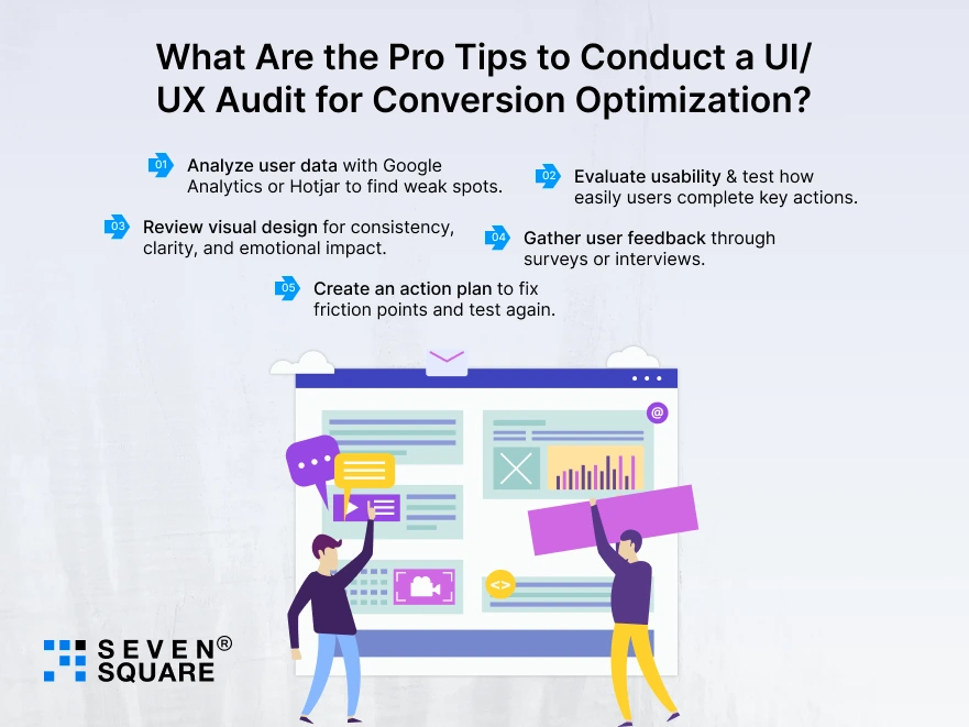
What Are the Pro Tips to Conduct a UI/UX Audit for Conversion Optimization?

Before redesigning everything, start with a UI UX audit for conversion rate improvement.
A UX audit helps you find exactly where your users get confused & here’s a quick step-by-step mini-guide:
- Analyze user data with Google Analytics or Hotjar to find weak spots.
- Evaluate usability & test how easily users complete key actions.
- Review visual design for consistency, clarity, and emotional impact.
- Gather user feedback through surveys or interviews.
- Create an action plan to fix friction points and test again.
When should you hire UI/UX experts?
- When your bounce rate is high, but traffic is steady.
- When users abandon checkout or forms mid-way.
- When your website “looks fine” but doesn’t convert.
Why Do Businesses Trust Us for UI/UX Optimization?
We help businesses turn clicks into loyal customers through smart design and conversion-focused UX strategy.
- Data-driven UI/UX design process: Every decision is based on analytics and user behavior, not guesses.
- Proven track record in conversion rate optimization: We’ve helped clients increase conversions by up to 40%.
- End-to-end design audit & redesign support: From UX audits to redesign implementation, we handle it all.
Want UI/UX Optimization? Contact Us Now!
Stop Letting Bad UI/UX Affect Your Conversions
Even small UI/UX design mistakes can quietly destroy your conversion rate and your revenue.
But the good news? You can fix it.
By identifying and correcting these conversion-killing UI/UX errors, your business can see measurable improvements in engagement, retention, and sales.
FAQs
- Common UI/UX mistakes include poor navigation, inconsistent design, slow load speed, & unoptimized mobile experiences.
- Poor UX design frustrates users, increases bounce rates, and makes it harder for them to complete desired actions, which leads to lost conversions.
- Start by auditing your website, simplifying navigation, improving mobile responsiveness, and optimizing CTAs.
- Over 60% of traffic comes from mobile. If your mobile UX is poor, users will leave, which drastically reduces your conversion rate.